

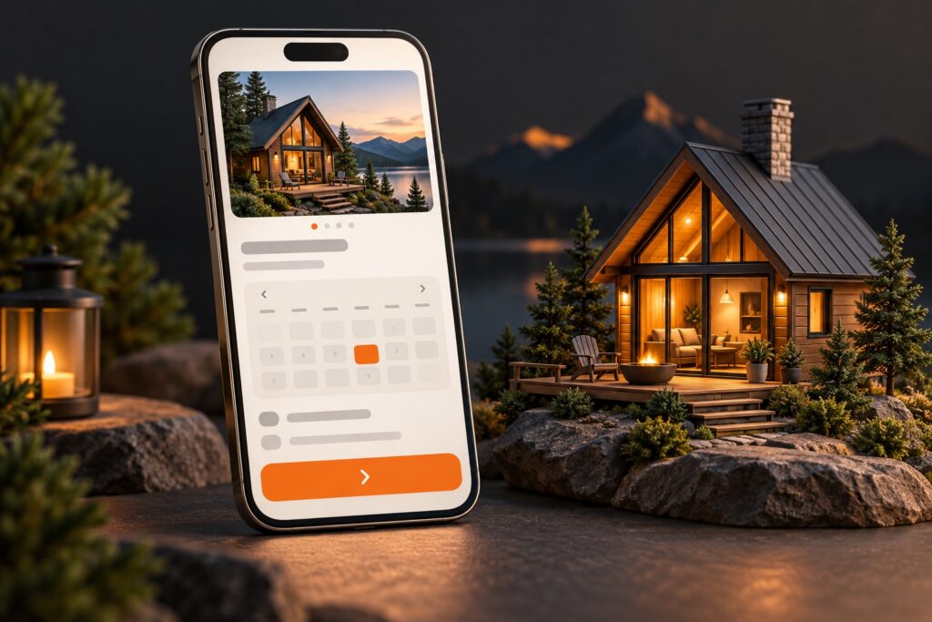
Most booking pages hide the information visitors need to book. This is a common reason why vacation rental and service sites lose mobile conversions. The right layout, with the right elements above the fold, makes a measurable difference in bookings.
01What Most Booking Pages Get Wrong
Many booking pages look fine on desktop but fail on mobile. We see these patterns in audits for vacation rentals, salons, and local service providers:
- Key info buried: Address, pricing, availability, and booking buttons are often pushed far down the page.
- Slow load times: Large hero images and unnecessary sliders delay the appearance of the booking form.
- Confusing forms: Multi-step or overly detailed forms frustrate users, especially on small screens.
- Missing trust signals: Reviews, guarantees, and cancellation policies are hidden or absent.
When a visitor lands on your booking page, they want to know three things right away: What am I booking, how much does it cost, and how do I book it? Anything that gets in the way increases drop-offs.
02The Critical Above-the-Fold Elements
On mobile, “above the fold” means what shows up without scrolling. You have seconds to earn trust and make the next step obvious. Here is what should appear immediately:
- Clear title and location: State exactly what is being booked (“2BR Lakefront Cabin” or “60-Minute Massage”) and where. Avoid vague headers.
- Price or price range: Show the nightly rate, session cost, or starting price. Hiding this leads to instant bounces.
- Availability or calendar picker: Let users check dates or times without scrolling. If you use a calendar, make sure it loads fast and works on touch screens.
- Primary booking action: The “Book Now” or “Check Availability” button must be visible and look clickable. Avoid ghost buttons or tiny links.
- Trust signals: Add a star rating, a short review snippet, or a “Free cancellation” badge. These build confidence fast.
Secondary info (full description, amenities, policies) can come later. But the essentials above must be instant.
03Mobile-First Layout Patterns That Convert
We have seen the best results with these mobile-first patterns:
- Sticky booking bar: Keep the price and booking button visible as users scroll. This reduces friction, especially on long pages.
- Accordion or tabs for details: Let users tap to expand policies, reviews, or FAQs instead of endless scrolling.
- Short, single-step forms: Only ask for what you need to reserve. Name, email, date, and payment if required. Collect more details after booking if needed.
- Fast-loading images: Use a single, optimized image above the fold. Save galleries for below or after the booking action.
Here is a pattern that works for vacation rentals and services alike:
- Header with title and location
- Price and review badge
- Date/time picker or quick calendar
- “Book Now” button
- Sticky bar with price and action
This structure puts the user’s goal first. Every extra step or hidden detail lowers your conversion rate.
04What to Avoid: Common Pitfalls
Some design trends hurt bookings more than they help. Here are pitfalls to watch for:
- Full-screen hero images: These push the booking form off-screen and slow down the page. Use smaller images or background photos.
- Multi-step forms with too many questions: Users drop off when asked for unnecessary info up front (like full address or special requests).
- Hidden fees: If the price changes after clicking “Book,” trust drops and so do conversions.
- Pop-up chat or offers covering the booking button: On mobile, overlays can block the primary action. Test your site with pop-ups enabled.
Audit your page for these issues. If you see a drop in bookings after a redesign, these are likely culprits.
05Real-World Results: What Changes Move the Needle
Across dozens of client sites, the same five changes made the biggest difference:
- Moving the booking button and price above the fold
- Adding a sticky booking bar on mobile
- Reducing form fields to the essentials
- Displaying a review or trust badge near the action
- Optimizing images for fast load times
One vacation rental site cut its mobile load time from over 4 seconds to under 2 by removing a full-width slider and compressing the main image. Bookings increased within a week.
Another service provider saw a 15% increase in completed bookings after switching to a single-step reservation form and adding a sticky “Book Now” bar.
06How to Test and Improve Your Booking Page
Improving your booking page is not a one-time job. Here is a practical process:
- Open your booking page on your phone. Can you see the price and booking button without scrolling?
- Time your page load with a stopwatch or a tool like PageSpeed Insights. Aim for under 2.5 seconds.
- Try booking as a customer. How many fields do you fill before confirming?
- Ask a friend to book and watch where they hesitate or get stuck.
- Check analytics for drop-off points. Are users leaving before reaching the booking form?
Small layout tweaks can lead to more bookings. Prioritize clarity, speed, and trust.
Every booking page is different, but the winning patterns are consistent. Put what matters first, test on real devices, and track your results. Your booking page should not just look good. It should book.
